A survey experiment to identify neighbourhood priorities
We conducted a “conjoint survey experiment,” an innovative survey instrument which presents respondents with two neighbourhood profiles, each composed of a set of attributes. Attributes include features like commute time, safety, school quality, diversity, local amenities and services, housing cost, typical mode of transit, sense of community, and built form (e.g., condominium apartments, single-family homes, etc.). The below video illustrates what it is like to participate in this experiment.
We selected attributes for the experiment based on prior research about neighbourhood preferences and social determinants of health (e.g. Ciorici and Dantzler, 2019; Wilson, Krizek, and Ahmed 2004; Mummolo and Nall, 2017; Schachter, 2016; Wheaton et al., 2015; Marans, 1979). Attribute values are randomly mixed and assigned to each of the two hypothetical profiles. Respondents were asked to pick which of the two neighbourhoods they preferred. Each respondent repeated the exercise six times. This randomization is central to the experimental design, which allows us to identify the causal effect of each attribute on neighbourhood desirability. The overall results of the conjoint experiment are shown below,
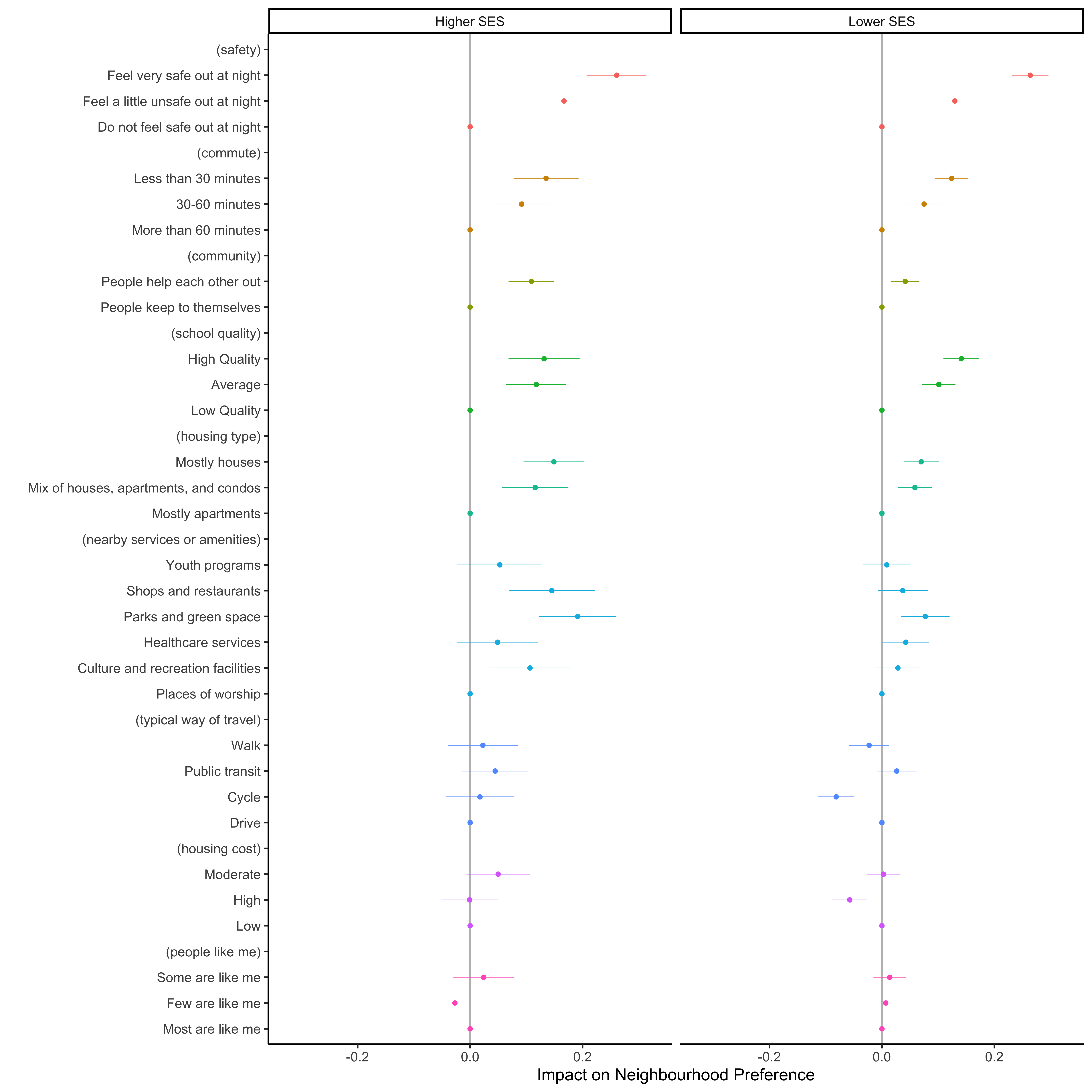
This figure summarizes results from our conjoint survey experiment. It represents a multivariate regression model, where the outcome is the neighbourhood profile selected by residents. Colored dots represent regression coefficients with the whiskers around showing their 95% confidence intervals. Where the whiskers cross the vertical line this indicates an effect that is not reliably positive or negative. Dots to the right of the vertical line indicate positive effects: these attributes increase the chance respondents will select a neighbourhood profile. Dots to the left indicate the attribute decreases the chance the profile will be selected. Dots without whiskers are reference categories for a given bundle of attributes. For example, for the “safety” attributes, “Do not feel safe at night” is the reference category. This means that the effect of the other safety attributes is in reference to not feeling safe at night. In other words, the dot for “feel very safe at night” shows that respondents are much more likely to select profiles with this attribute compared to profiles showing a neighbourhood where they “do not feel safe at night.
The above figure compares results for our core study areas (on the right) and the control, higher SES neighbourhoods (on the left). One key takeaway is that the overall shape of residential priorities is very similar across these contexts. In other words, residents in lower SES neighbourhoods share many of the same priorities that residents in higher SES neighbourhoods do: a safe place without long commutes or low quality schools, where neighbours help each other out, with ample parks and green space, and which is not dominated by apartments or high-rises. In addition to these commonalities, we found some differences. Residents of the lower SES communities more strongly valued low or moderate housing costs over high costs, whereas the higher SES communities were less sensitive to housing cost; lower SES communities were less likely to prefer neighbourhoods where people get around by cycling; and higher SES communities had somewhat stronger preferences for a neighbourhood with shops and restaurants or culture and recreation facilities.
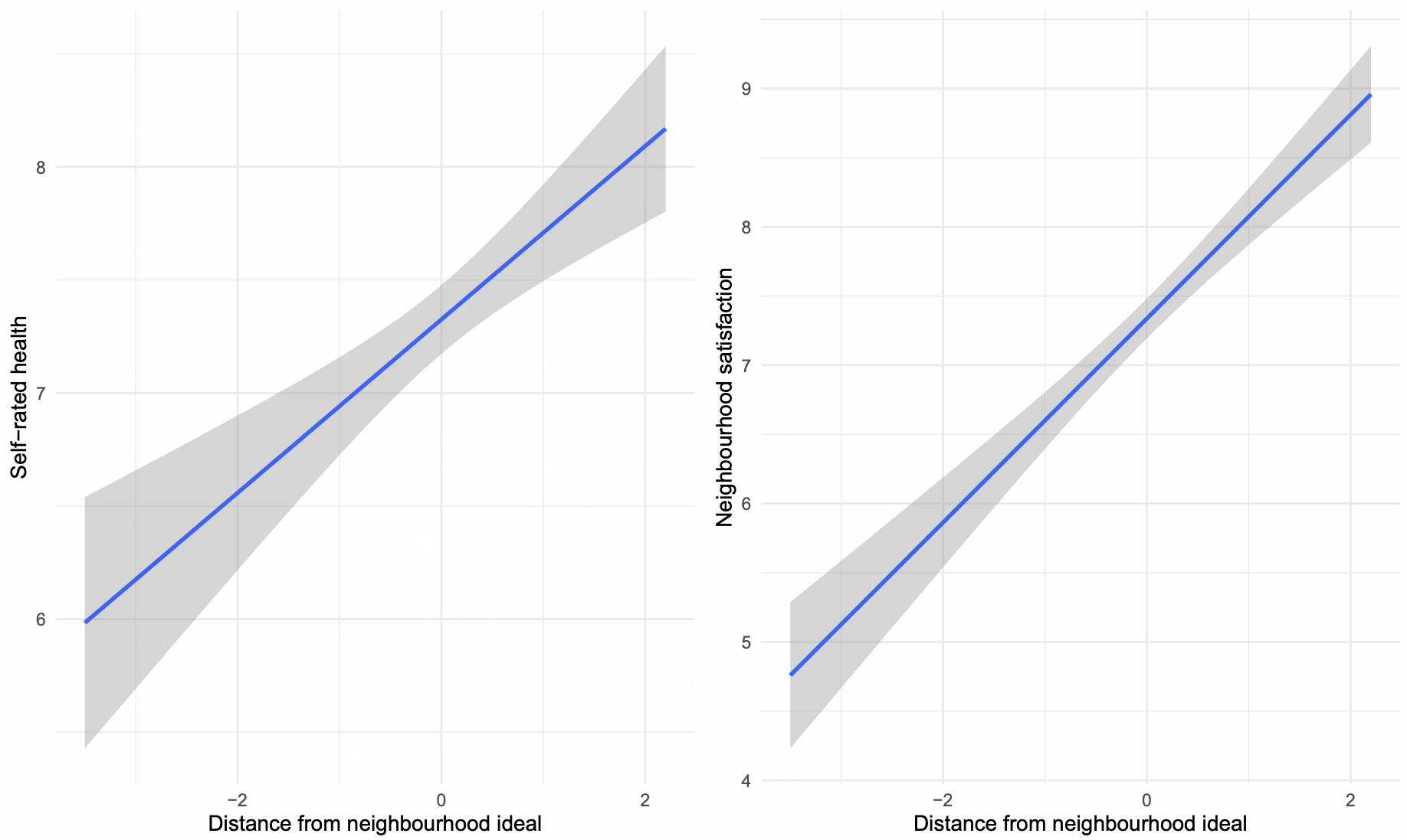
Our survey also asked respondents about the presence of the same attributes from the conjoint survey in their own actual neighbourhoods. Comparing the two responses allowed us to determine how closely residents’ actual neighbourhoods correspond to their ideal neighbourhoods. We created a metric that measured this difference between ideal and actual, which ended up giving us a number of insights. In our study, residents of the lower SES communities perceived their own neighbourhoods to be substantially further from their ideal, compared to residents of the higher SES communities who live in neighbourhoods that more closely resemble their ideal neighbourhood.Though neighbourhood aspirations are similar across these contexts, the degree to which actual neighbourhoods permit residents to realize these ideals is not.
This figure shows that residents who live in neighbourhoods’ that fall short of their ideal enjoy substantially lower levels of satisfaction and self-rated health, compared to otherwise similar residents who live in a neighbourhood that aligns with their ideal.
As one’s actual neighbourhood grows farther from one’s ideal, overall neighbourhood satisfaction, self-reported health, and confidence in civic institutions all substantially decline. In fact, these consequences flowing from the gap between one’s actual neighbourhood and one’s ideal neighbourhood were some of the strongest we observed in our research. This underscores the crucial importance of resident priorities for local policy: residents’ beliefs about how their neighbourhoods align with their values and priorities has material significance in a number of areas that impact overall satisfaction with their communities and ultimately their health.